Designs
2025

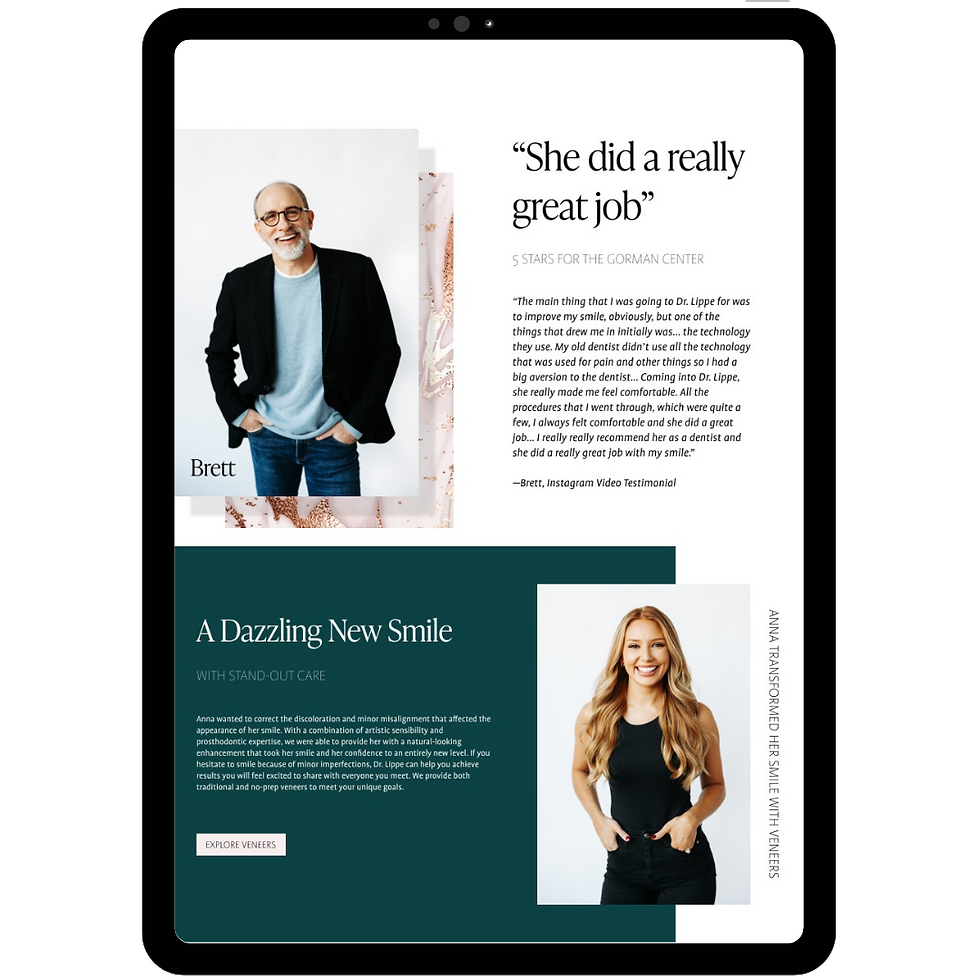
The Gorman Center
BRANDING & LOGO
This client recently took over the practice after the previous owner retired. Her buzzwords were high-class, modern and elegant. She was keen on a light site with a mix of warm and cool colors, specifically teal. I started with a dark teal then found a warm pink and neutral texture background that paired well. Based on her reference sites and high-class feel, I wanted to break the grid but still give her something modern and clean.

Center for
Dental Wellness
WEBSITE DESIGN
This client was a holistic dentist who wanted to highlight their natural but effective treatment methods and the natural beauty of their practice area, Post Falls, Idaho.
The neutral and olive green colors amplify the location imagery and reflect the colors used in their office. The amber texture was chosen to complement a textured wall in their lobby.

Center for Dental Wellness
Website Design
This client was a holistic dentist who wanted to highlight their natural but effective treatment methods and the natural beauty of their practice area, Post Falls, Idaho.
The neutral and olive green colors amplify the location imagery and reflect the colors used in their office. The amber texture was chosen to complement a feature wall in their lobby.


Harbor View
BRANDING & LOGO
This client was opening a new practice in Kenai, Alaska. During the welcome call he was adamant about making his site “Scream Alaska” and mentioned the northern lights more than a few times, so I thought that would make the perfect, bold hero. I added sketches of classic Alaskan animals and chose bold fonts to give it the rustic, outdoorsy feel that you think of when you think Alaska.
Tarrant Plastic Surgery
REBRANDING AND SEO OPTIMIZATION
Long-time client of our agency, Tarrant Plastic Surgery, was in desperate need of a brand refresh. We wanted to modernize their site while keeping the same feel for their current patients. We focused on improving SEO, bringing pertinent information and more CTAs to the top of the page to facilitate conversions. The result is a cleaner, more modern site that adheres to SEO best practices and improves the user experience.